
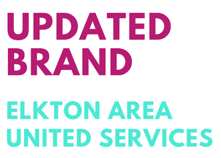
One of the main initiatives of our campaign was to ensure that Elkton Area United Services promoted a cohesive brand throughout all of their platforms and communications. Cheryl Pavlik, the volunteer coordinator, expressed to us that it is difficult for people to recognize Elkton Area United Services when it is referred to as EAUS. We knew that it was important for the new logo to have the full words and for the new branding to have consistent colors. With the change of their brand, it is our hope that people will have a better understanding of what the organization does.
Brand Colors
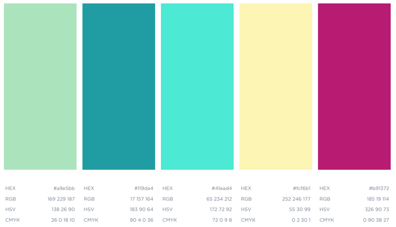
After the EAUS board of directors decided on the colors above, we got to work by creating content that was consistent with the brand. Additionally, signs were created to put up at the EAUS locations in order for clients to recognize the buildings. Ultimately, our goal of establishing a consistent brand for the organization was very successful.
New Logo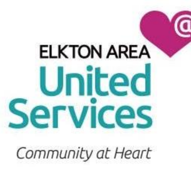
|
Old Logo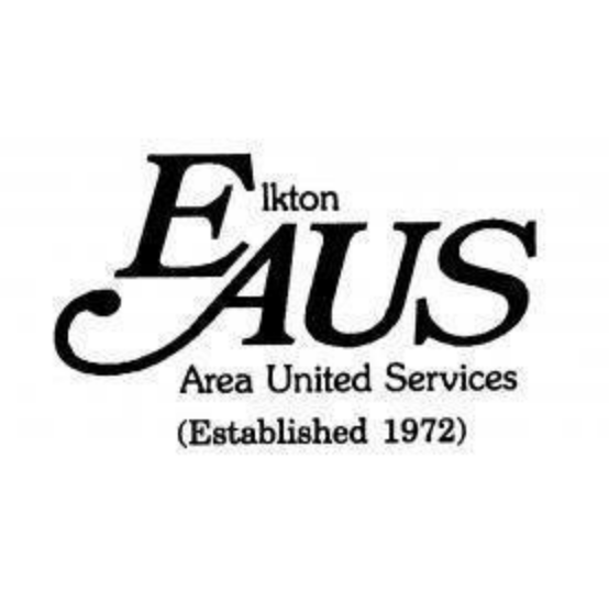
|
